“The New Cue”
Creative Direction / Editorial Design
Summer Barbecue Issue of The Local Palate. Bold typography, dramatic photography, and unexpected colors introduce readers to Charleston’s Lewis Barbecue and its modern approach to Texas brisket.
Recognized as finalist for “Most Delicious” cover
by the American Society of Magazine Editors

“Chef Vivian Howard”
Creative Direction / Cover Photography
No. 1 selling issue of The Local Palate. Recruited Chef Vivian Howard for cover of Thanksgiving Issue. Staged and directed on-location photoshoot at her Kingston, North Carolina home. Photographed cover story featuring Chef Howard and her family's gathering, along with five exclusive recipes.
Photoshoot aired as an episode of PBS’s Emmy Award-winning show “A Chef’s Life”
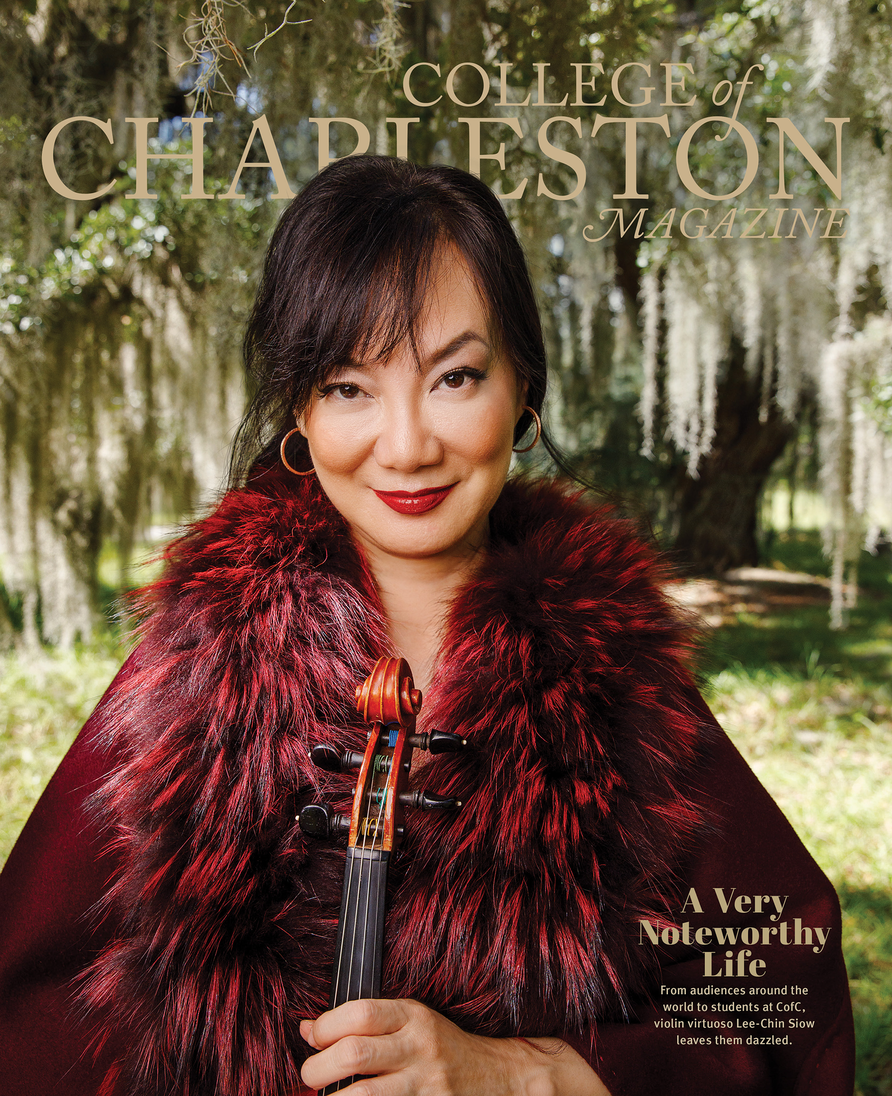
“A Very Noteworthy Life”
Creative Direction / Cover Design
Featuring trailblazing Singaporean violin virtuoso and Associate Professor of Music, Lee-Chin Siow, for her cover story "Music Professor Is Playing it Forward." The visual narrative captures her dazzling global presence by contrasting her bold, high-fashion styling against the quiet, moss-draped Lowcountry landscape of Stono Preserve.
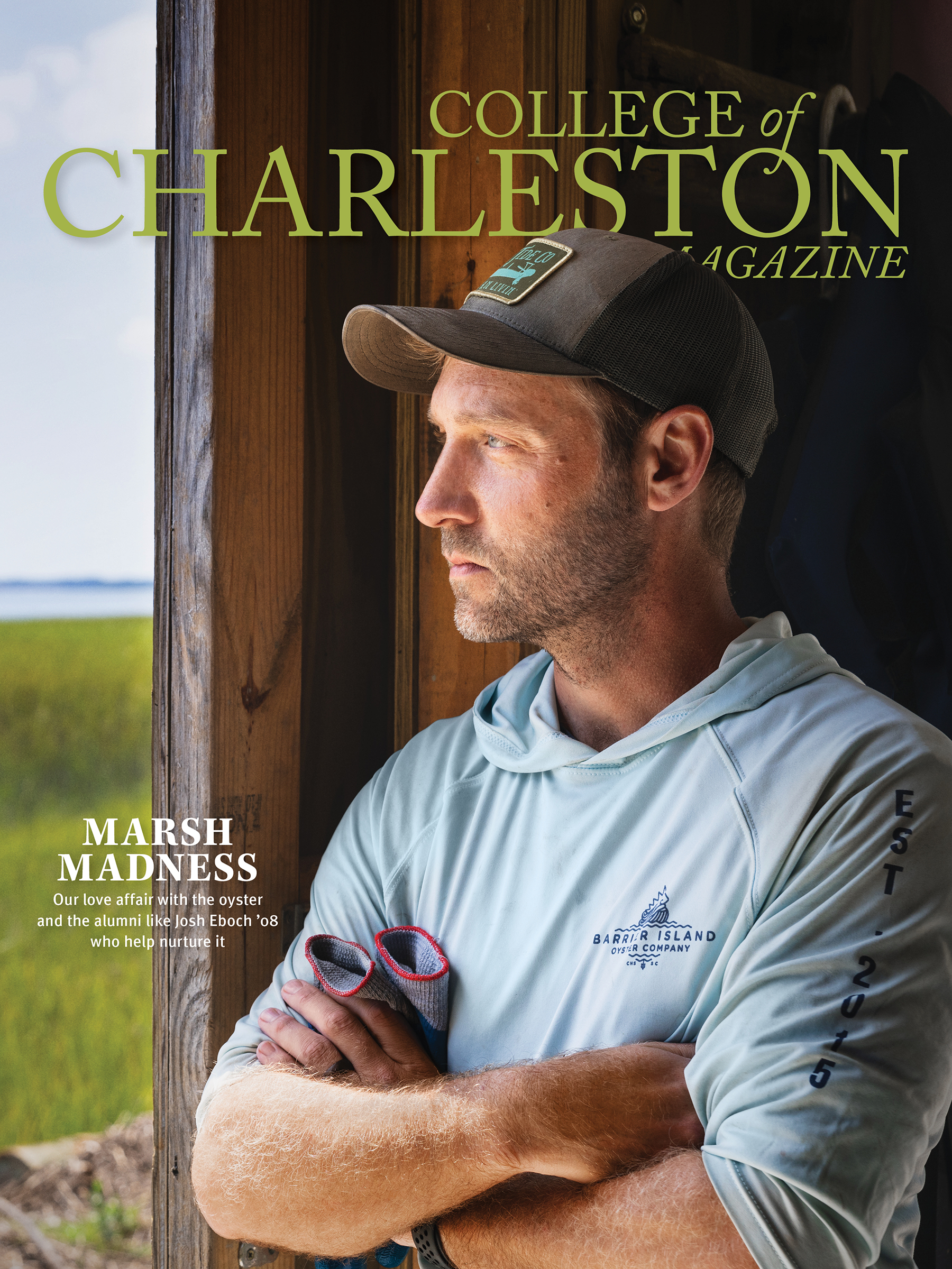
“Marsh Madness”
Creative Direction / Cover Design
Cover features alumni , Josh Eboch ’08, founder of Barrier Island Oyster Co. To communicate his pioneering impact on sustainable aquaculture, the cover image features Eboch looking off-camera into the distance. This intentional composition anchors a modern visual narrative that blends a rugged, coastal working environment with a focus on the future of the local shellfish industry.
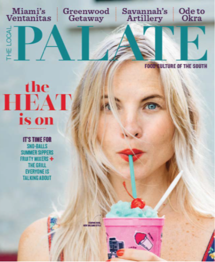
“The Heat Is On”
Creative Direction / Cover Design
Collaboration with award-winning New Orleans photographer Denny Culbert. Feel-the-heat casting and saturated summer colors combine with “sno-ball” in August refreshment to bring a cool new vibe to the idea of food culture in the South.
Designed to attract a young audience, this cover produced record newsstand sales for The Local Palate
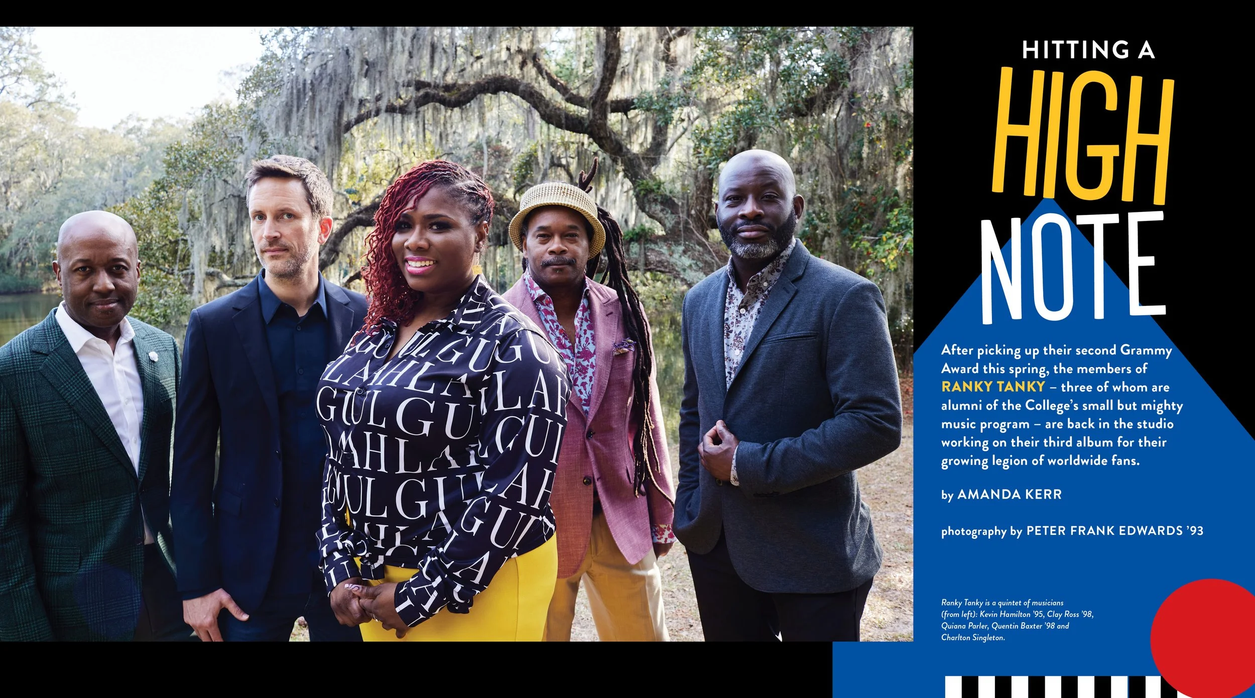
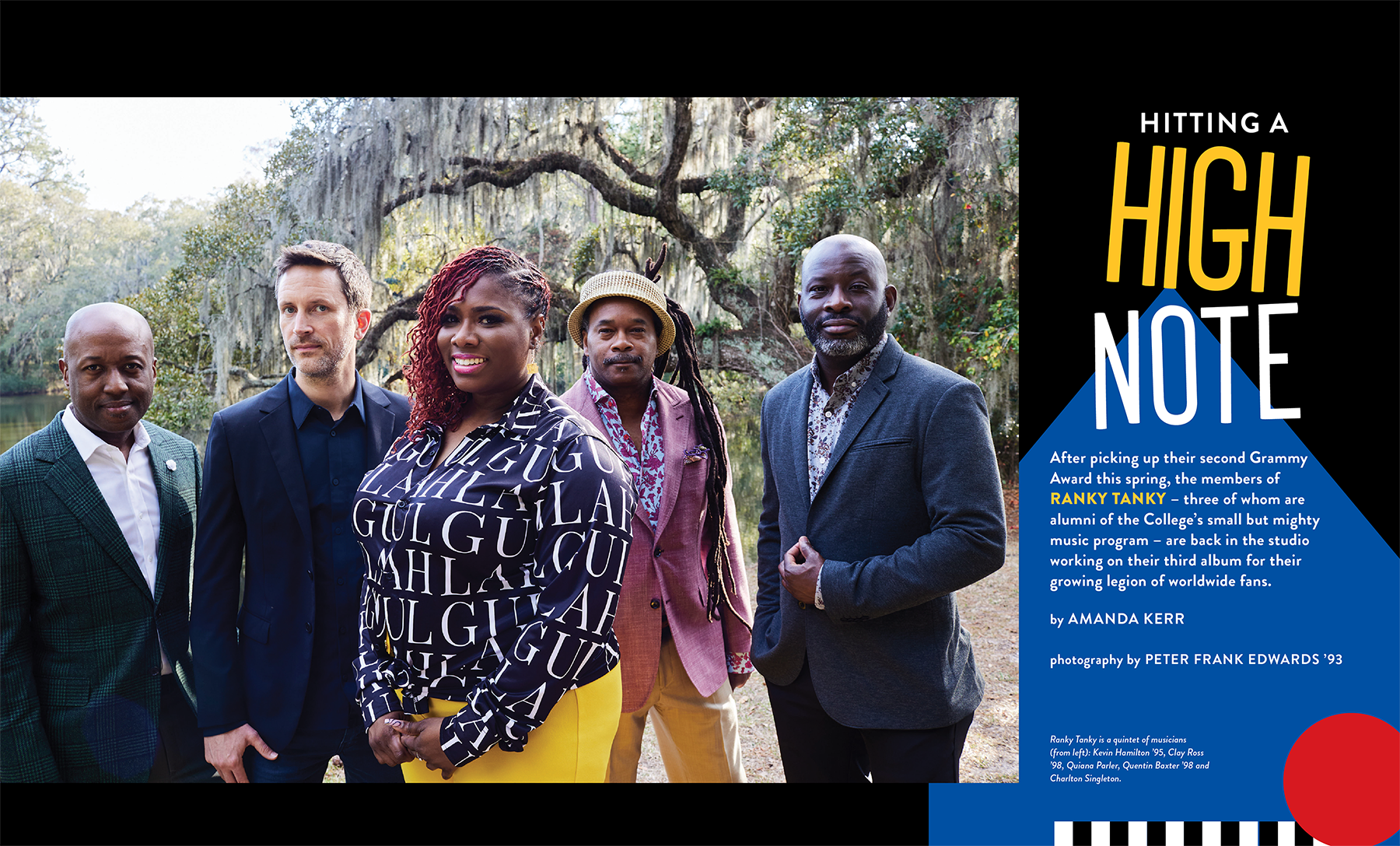
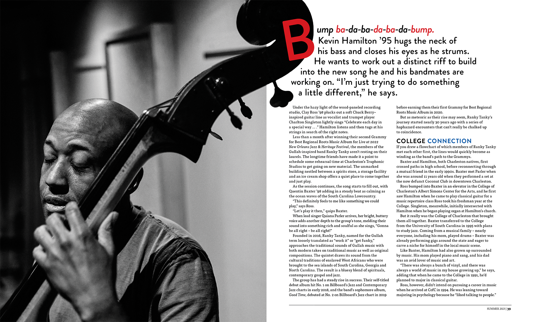
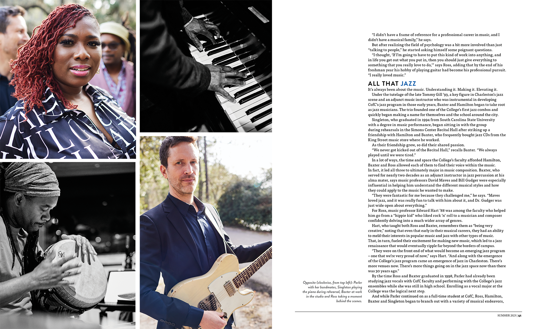
“Hitting a High Note”
Editorial Design | College of Charleston Magazine
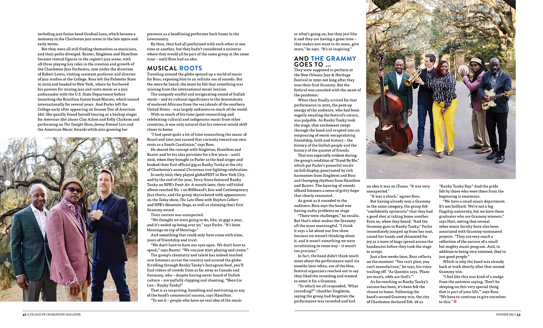
Grammy Award-winning jazz quintet Ranky Tanky, three of whom are College of Charleston alumni, photographed by acclaimed Charleston photographer Peter Frank Edwards. Playful typography and a bold graphic palette were designed to match the infectious energy of a band rooted in the soul of the Lowcountry.

“Close to the Heart”
Editorial Design | College of Charleston Magazine
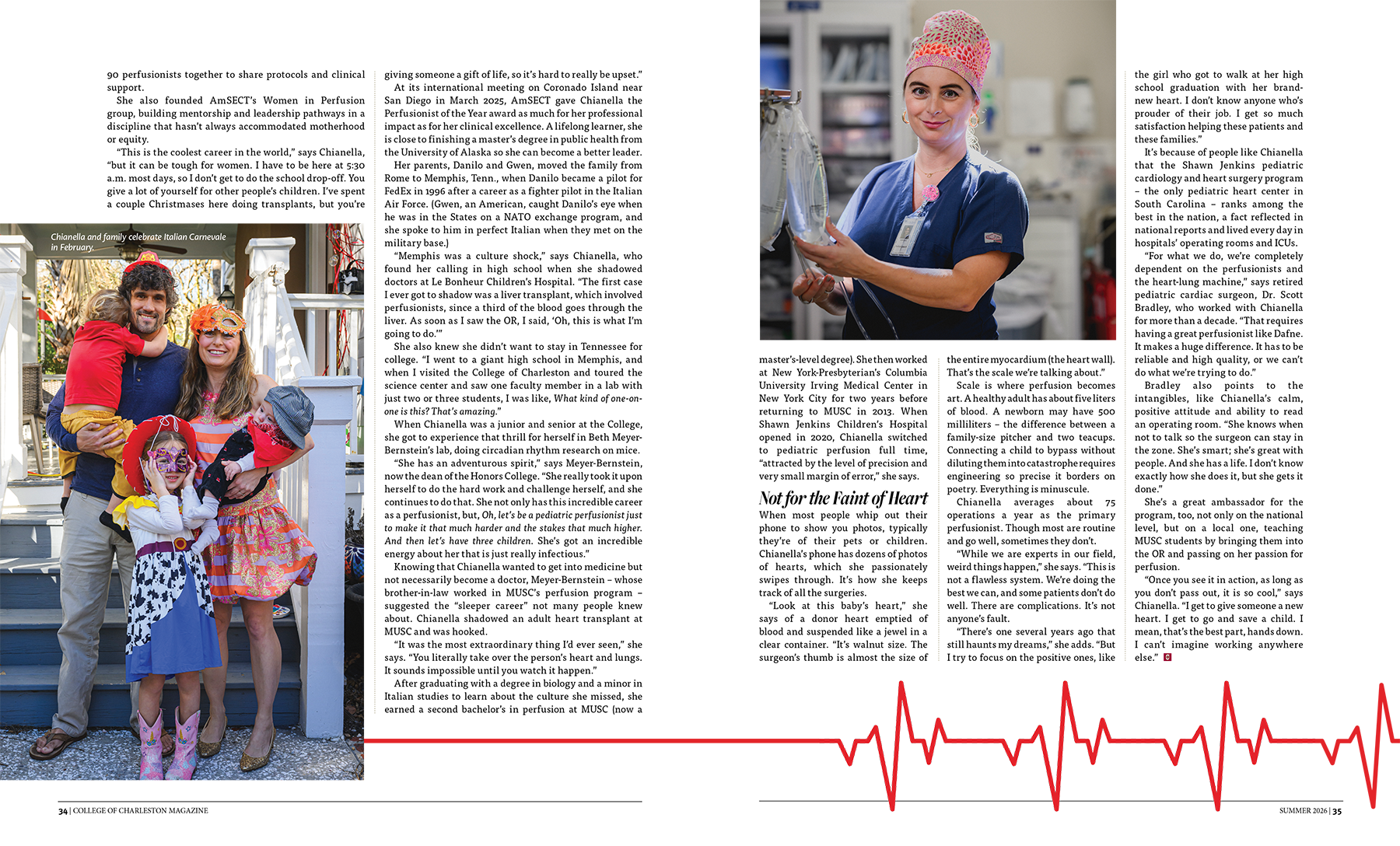
A clean editorial layout balances the documentary-style surgical room photography. Because the operating scenes are dense, the layout is kept simple to keep the photography front and center. Minimalist heart-monitor vector lines weave through the columns, adding a subtle visual cue that anchors the text without distracting from the images.



“A Level Playing Field”
Editorial Design | College of Charleston Magazine
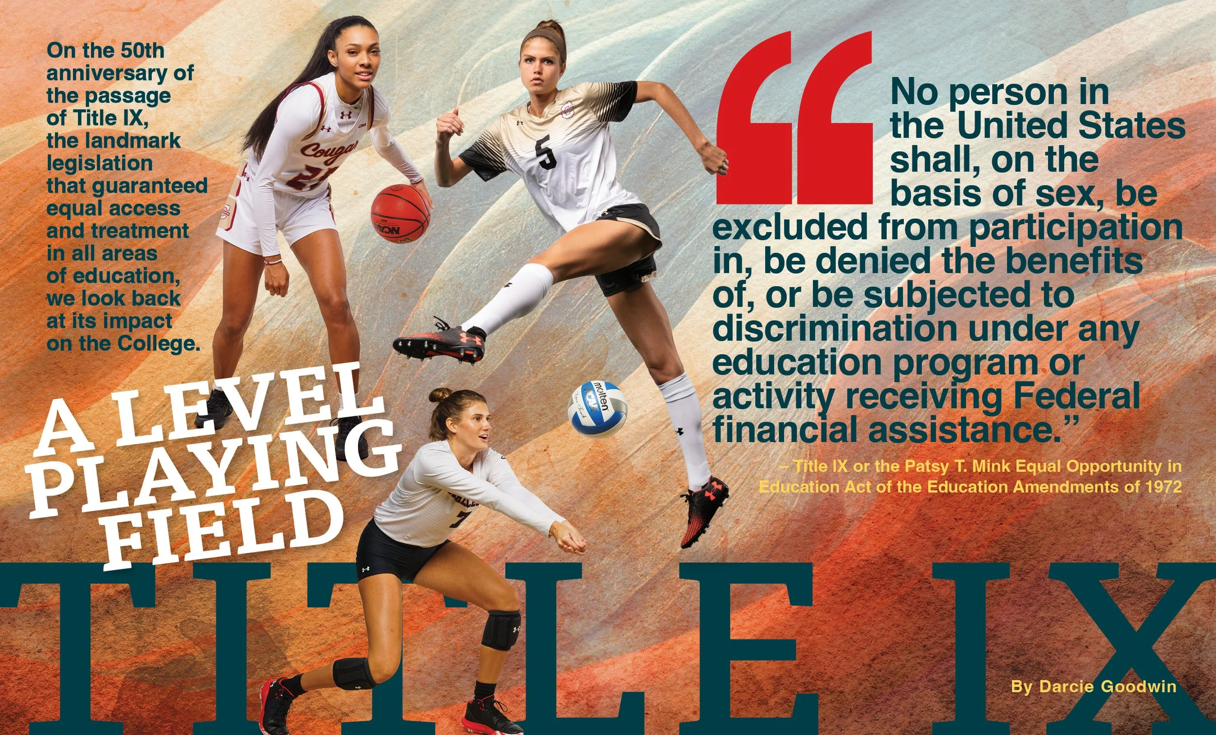
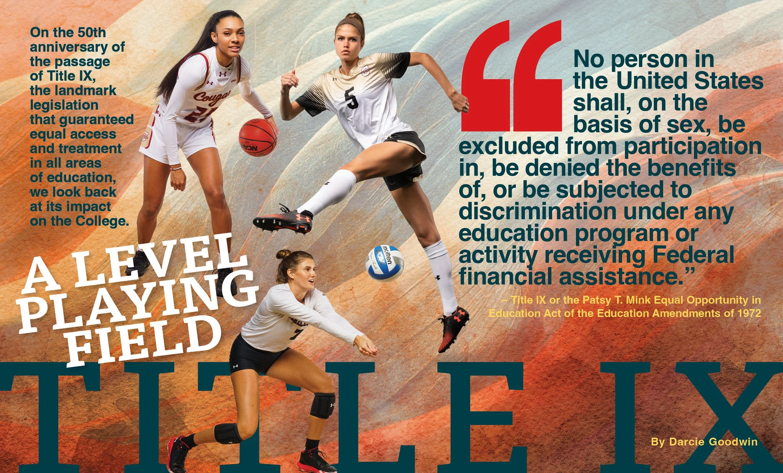
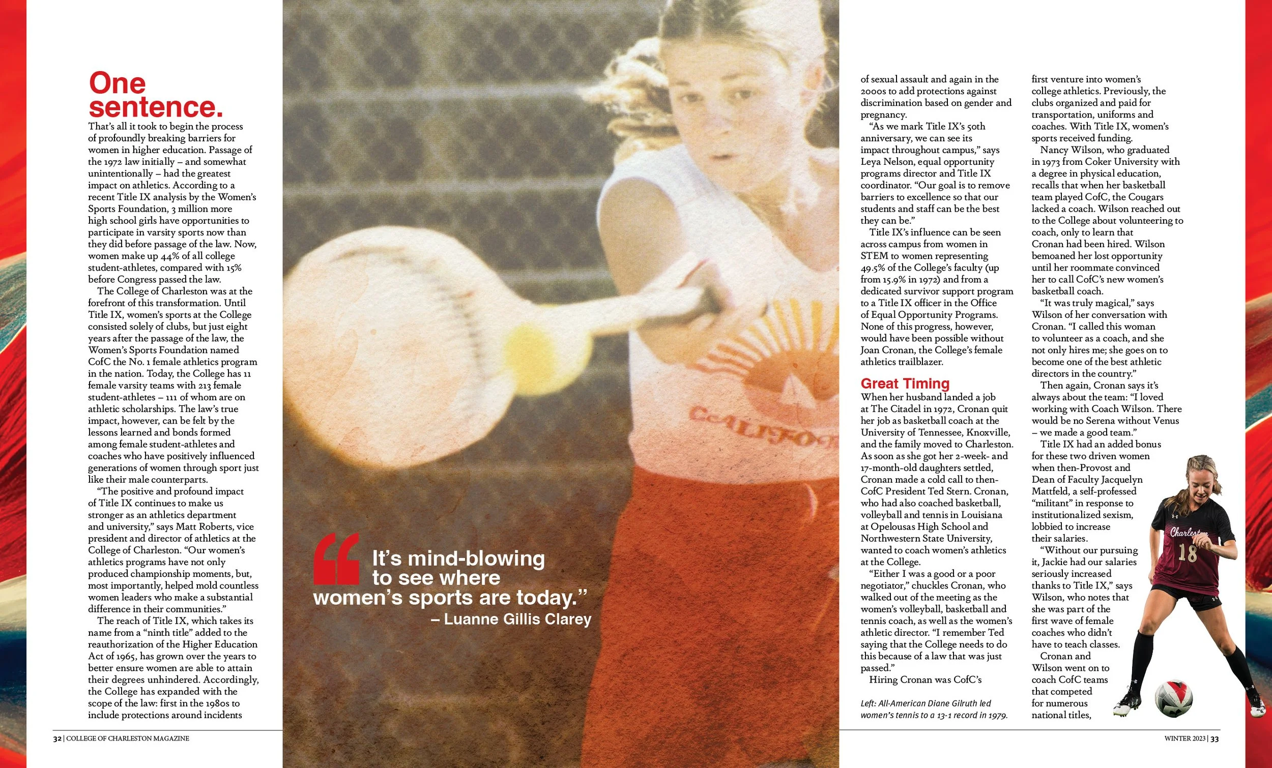
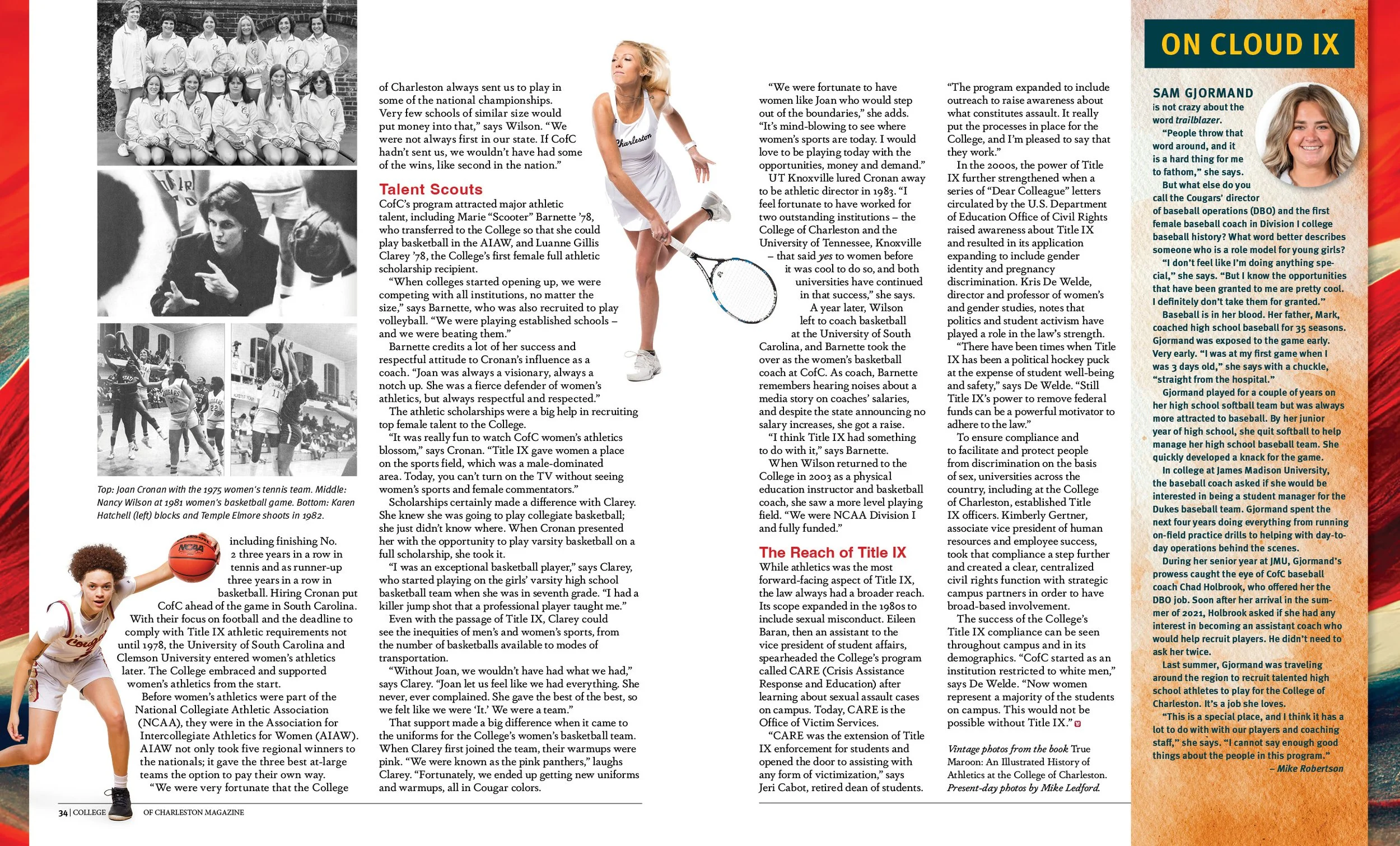
Designing this celebratory spread for College of Charleston Magazine required grounding a modern, high-motion athletic layout with the College's real history. To build out the narrative, I dug through old yearbooks and campus library collections for historical images. The resulting design pairs an oversized, legislative quote block with dynamic action shots, running a giant bold headline across the bottom grid to structure the timeline clean and effectively.

“CHEF vs. COOK”
Editorial Design | The Local Palate
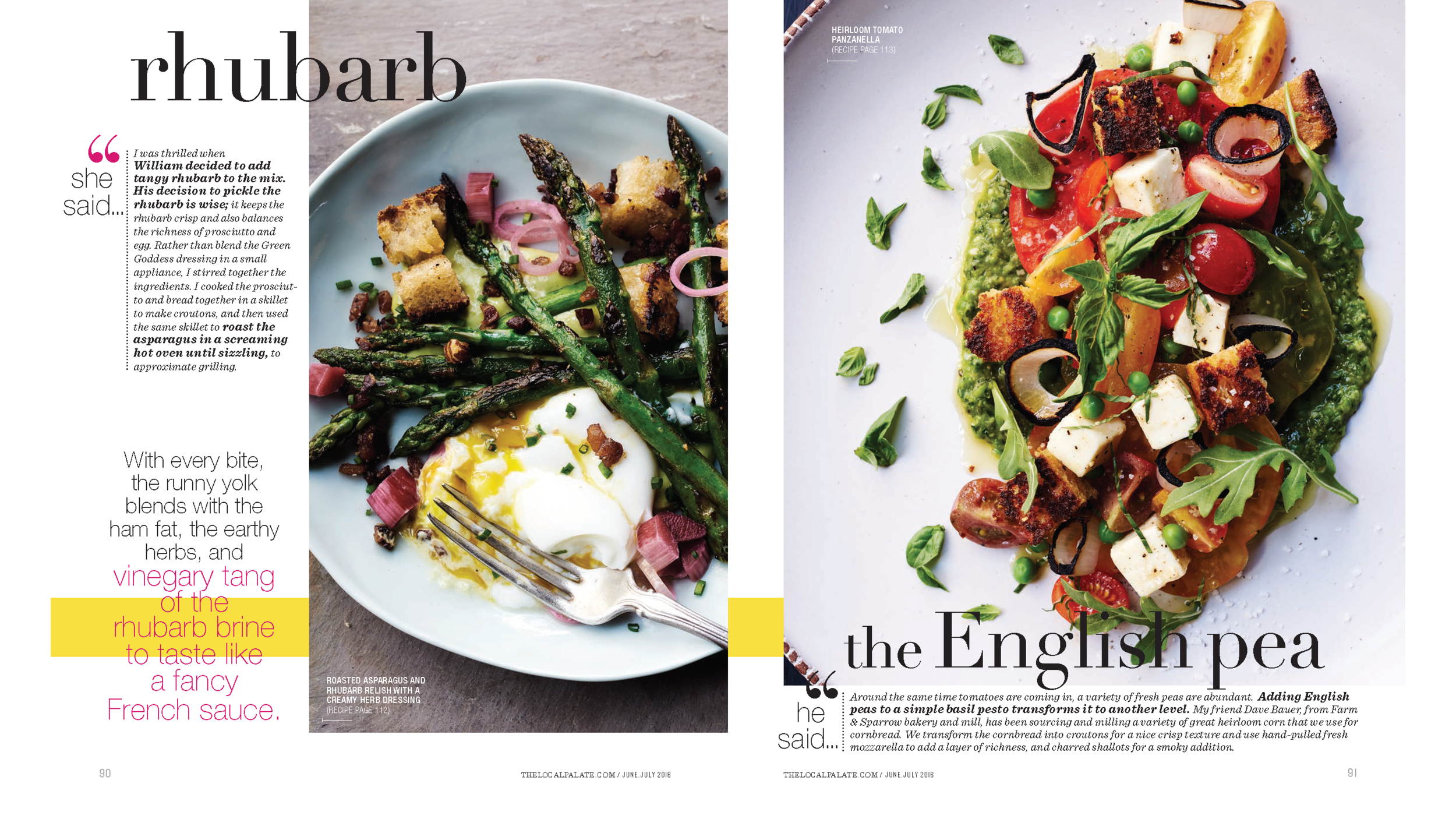
The dramatic face-off of a James Beard nominated chef versus a prominent cookbook author in a contest to develop new recipes using the same ingredients. This tour-de-force design engaged a prop stylist for consistency of look and feel. Strobe photography to capture bright colors and subtle textures. And elegant headline typography to compliment the cinematic lighting and fashion-feel of the images. Five extravagant spreads include pull quotes, expert tips, and detailed methodology as artfully crafted as the recipes they document.




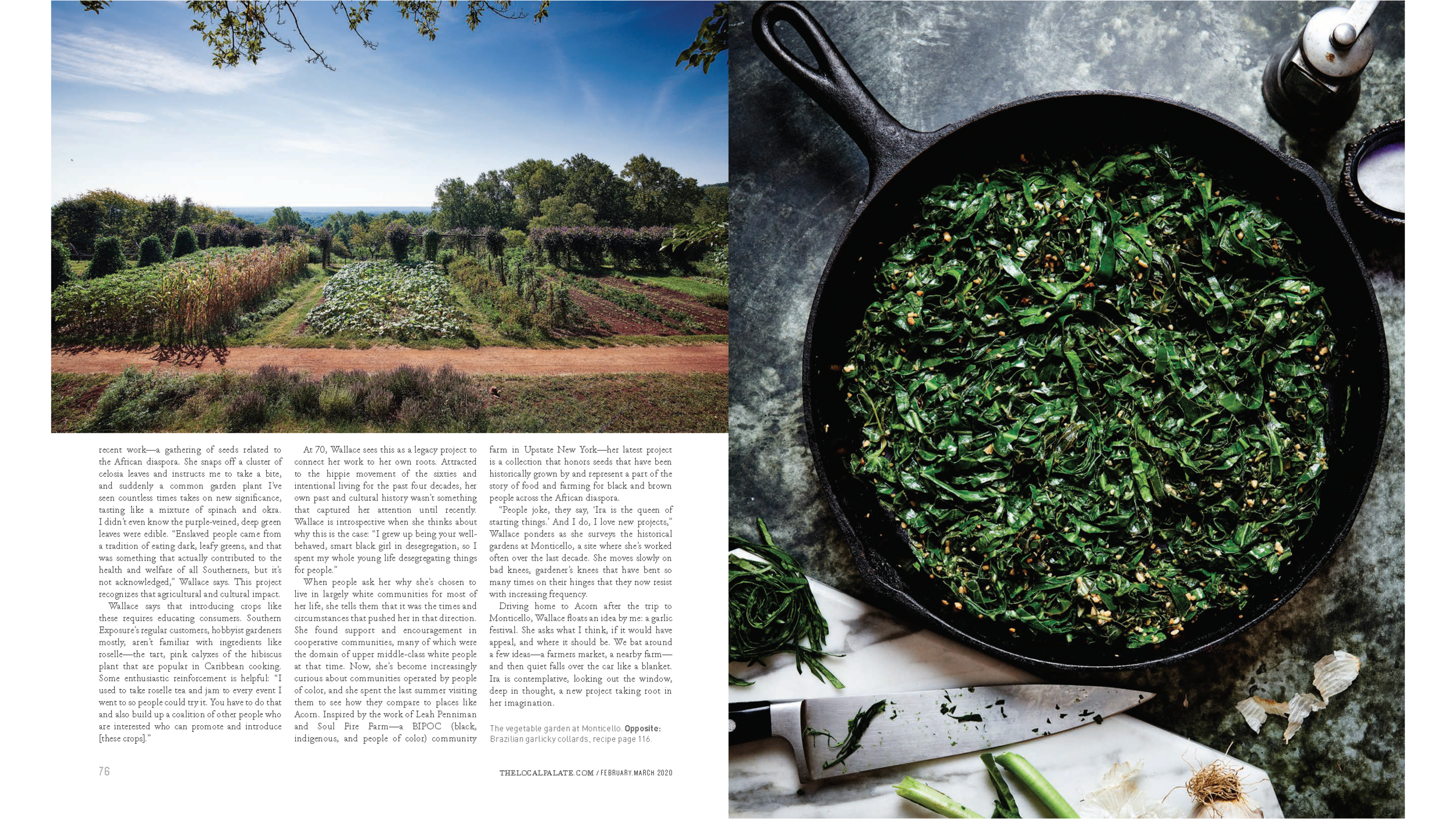
“SEEDS OF RESISTANCE”
Editorial Design | The Local Palate
Ira Wallace’s beautifully aged hands served as the perfect metaphor for a profile on her extraordinary life and times as a passionate heirloom seed gardener. A story born of the soil and felt in the heart that fed the souls of thousands of readers of The Local Palate. Designed with a simple grace to be shared across generations as a legacy of Ira’s art.